Balance has always been a vital element in every walk of life. Whether it’s about having the right balance of facial features which add elegance into a human being’s face or maintaining the right balance in personal and professional life; balance has been considered as one of the most desired characteristic of every composition. The same concept applies to the web design world as well. No matter how aesthetically pleasing your design is, if it doesn’t have the right use of symmetry; it may easily fail in impressing the targeted audience. I’ve written this post to make you familiar with the significance of using symmetry in web design. Hope by the end of this post, you’ll be all motivated to use this absolutely brilliant element in your upcoming web design project.
Understanding Symmetry and its types
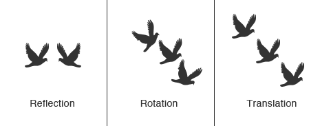
Symmetry basically refers to the web design principle wherein a perfect balance is being maintained between two or more opposing sides. It mainly refers to the accurate arrangement of well-proportioned and balanced elements within a web design. If you’re looking for enhancing user experience in your web designs, then nothing can beat the use of symmetry.
Here’s a look at some of the most significant types of symmetry:
1. Radial or Rotational Symmetry
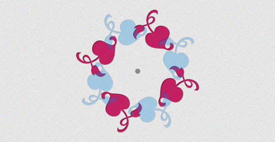
Rotational/radial symmetry is when a particular object is being rotated around a single central point. Here, the object is turned in equidistant increments but looks the same as it appeared in its original position. Some popular examples showcasing the use of rotational symmetry in web designs include: design patterns, signs and letters. The only drawback associated with the radial type is that it can be tedious to replicate its use in some design sections. It is interesting to note that a majority of designs using radial symmetry are circular or square shaped.
2. Reflection Symmetry
As one of the most common types of symmetry, Reflection Symmetry/line symmetry results in producing a unique ‘mirror’ effect of an object that has two different sides. For instance, a butterfly is a perfect example of reflection symmetry mainly because its one half is a mirror image of the other one. In case of web designs, reflection symmetry can be conveniently used for grouping rows containing related elements. Doing this will allow the website visitors to locate similar elements in a hassle-free way; thereby improving the overall user experience.
3. Translation Symmetry
Translation symmetry is when an object is moved to a different position while maintaining its basic orientation. Dedicated to holding complex patterns on a two-dimensional space, this type of symmetry doesn’t mean that all the objects will have the same size. If you’re inclined on adding a sense of speed, dynamic action and motion into your web designs, then go ahead with using translation symmetry right away. With this, you can easily place pieces of content(text or images) of almost same size and spread them across the web design while still maintaining enough amount of space.
4. Horizontal Symmetry
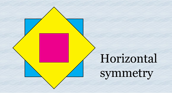
One of the easily spotted symmetry types is the horizontal symmetry. For instance, simply draw a line through the center of an object from top to bottom and if both the sides end up forming a single outline, the object is considered to be horizontally symmetrical. Here, you need to remember that the content placed within the mirroring shapes can either be same or somewhat different.
5. Vertical Symmetry
As a recognized counterpart to horizontal symmetry, vertical symmetry is where the line is drawn through the center of the object from left to right and both the sides result in creating a single outline. Serving as an excellent fit for portfolio and photography websites, Vertical Symmetry allows you to group rows with similar types of elements.
Symmetry has a significant role in enhancing the user experience
Symmetry allows you to attain a sense of consistency and stability across the website. By adding it into your website, you are in a way making your visitors understand each and every thing about your web portal. You are allowing them to understand the correct use of a particular functionality that has been incorporated into the site. With symmetry, uniformity gets added into your web designs, thereby rendering a pleasing user experience.
Conclusion
As a powerful web design tool, symmetry helps you in creating a design that has a perfect blend of balanced elements which appeal to the visitor’s eye. If you like things to be organized on your website, then using symmetry in the web design is perhaps the best approach to follow.
Author bio:
Samuel Dawson is a highly skilled expert in Web Development. He is working as Sr. Web Developer in Designs2HTML Ltd, a incessant company involved in to convert psd to html with innovative designs. Instead of all these things Samuel also spent some time on research & development.

No Comments