A guest post witted by Eve Pearce
Each decade of the 20th century was defined by its own style, and if we talk about a certain year, chances are you’ll have a strong mental picture of what the music, fashion and designs were like. This is true of the car industry too, even those who know nothing about cars can often place them in a certain decade just by looking at the design and features of a vehicle. Therefore, successful adverts for cars often reflect strongly on the general ‘feel’ of the time, and here are some classic examples of posters and magazine adverts that did just that.
Owen Magnetic – 1920
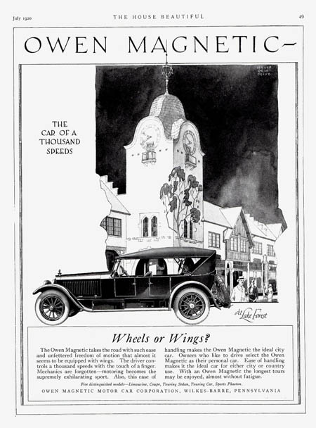
The 1920s are often seen as being decadent, yet elegant, and this advert shows how these two qualities can be combined. A car was, of course, a luxurious purchase in this era, and if you were wealthy enough to own one, you probably didn’t choose to drive, but would hire a chauffeur. However, this advert is showing how the trend towards ‘personal cars’ was growing, offering drivers the thrill of being able to zip around city and country alike ‘with the touch of a finger’. The setting is Lake Forest, Illinois, a popular stop on the way to Chicago, but at first glance it could well be any European city with people milling around in fashionable clothes. Well-dressed observers look enviously at the car, but the Owen Magnetic isn’t necessarily the focus of the advert. Rather it blends into its elegant surroundings, as part of the glamorous lifestyle it’s promoting.
Ford Monarch – 1949
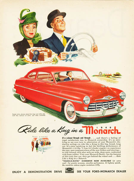
This advert promises that men can ‘ride like a king’ in the Monarch, and the man in this advert certainly looks proud of his new purchase. The gender roles of the era are clear for all to see, with the respectable, hat-wearing couple made up of a lady who likes to bake, and a manly man whose shiny new car boasts thrilling performance features. It’s telling that the advert devotes as much space to a portrait of the couple as it does to the car, showing that hey, these are the kind of people who drive our cars, don’t you want to be just like them? Everything is colourful in this advert, showing that in the post-war period, people were ready to be cheerful and spend freely on cars and fancy hats.
Volkswagen Beetle – 1960
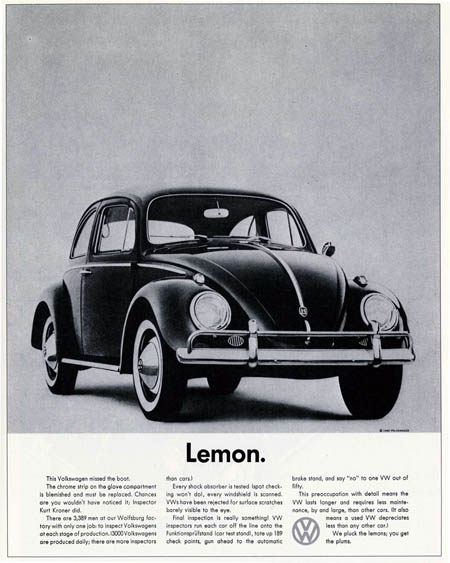
A black and white photo of the car, and in bold print underneath ‘Lemon.’ This was enough to make the campaign iconic, and it was even referenced on an episode of Mad Men where they admired its eye-catching, self-deprecating tag-line. Volkswagen’s campaign centred around them being perfectionists to a ridiculous degree, but showed that they understood the rebelliousness that was starting to emerge in this era. The monochrome, minimalistic design showed a move away from the gaudy designs of the previous decade, to a more subtle, stylish look. There are no cheesy happy families or bright backgrounds to distract you, leaving you to focus solely on the design of the car.
Jeep Grand Wagoneer – 1983
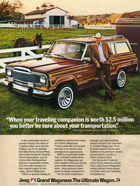
The 1980s were about excess, and this Jeep advert isn’t shy about showing conspicuous consumption at its best. With Dallas one of the most popular shows on TV, people were fascinated by the lifestyles of the nouveau riche in the American south, and cowboy Bob Norris is proud to show off his shiny belt buckle and 2.5 million dollar horse. The autumnal colours of the car blend in perfectly with the landscape, but since neither the car nor the cowboy have a speck of mud on them, the scene feels rather fake. However, it’s an eye-catching advert, if only for the sheer glossiness of the scene.
Toyota Celica -1992
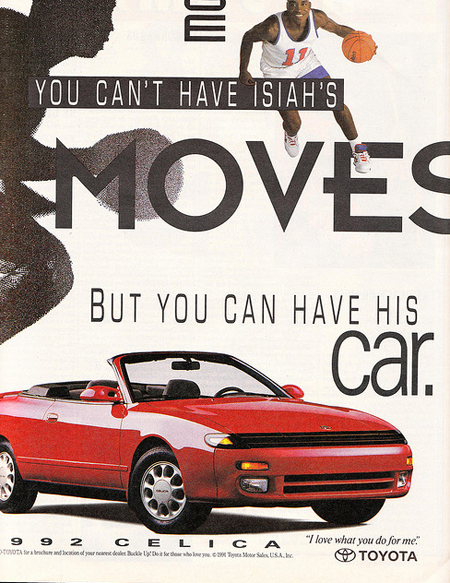
The mix of different fonts at random angles really dates this advert as being from the 1990s. Car adverts from this era often featured celebrities, or even cartoon characters giving their endorsements, and this one features a basketball player so famous, we apparently know him on first name terms. We seemingly don’t need to know anything else about the car, just that a certain basketball player drives it, and this shows how fads and fashions were fairly shallow and short-lived in the decade. The colours used are simple, but this makes the shiny, red car stand out even more and gives it an almost plastic appearance.
Adverts from certain eras reflect the hopes and aspirations of the time, and no more so than in car adverts. Cars are something we flaunt to the world, something that show our tastes and personality in a very conspicuous way, and advertisers are sure to show this in their choice of design.
Image Sources:
http://upload.wikimedia.org/wikipedia/commons/7/70/1920_Owen_Magnetic_Touring_Car_ad.jpg
http://www.oldcaradvertising.com/Ford%20of%20Canada/Ads-Cars/1940s/1949%20Monarch%20Ad-03.html
http://community.brandrepublic.com/photos/beetle_lemon/images/47605/original.aspx
http://oldcaradvertising.com/Jeep%201970-87%20Ads/1983/1983%20Jeep%20Ad-01.html
http://www.flickr.com/photos/28639693@N03/3793181746/

0 Comments